Strava
Capstone UI/UX case study
Improving the “hidden” training plan feature on Strava
Improving the “hidden” training plan feature on Strava
Introduction
Strava is a GPS-based exercise tracking service made for runners and cyclists to track their activities. Strava can be connected to a smart watch and has social features like sharing workouts and giving kudos.
Strava is a GPS-based exercise tracking service made for runners and cyclists to track their activities. Strava can be connected to a smart watch and has social features like sharing workouts and giving kudos.
Role
UX/UI Design, Research
UX/UI Design, Research
Platform
Mobile (IOS)
Mobile (IOS)
Tools
Figma, Maze, Google Forms, Old notebook and a pencil
Figma, Maze, Google Forms, Old notebook and a pencil
Duration
80 hours (Overall 3 months)
80 hours (Overall 3 months)
Background
Finding a suitable training program can be challenging for novice runners looking to participate in a race.
Strava offers Training plans. Unfortunately, the feature is hidden behind a paywall, and is hard to access unless you are aware of it.
Finding a suitable training program can be challenging for novice runners looking to participate in a race.
Strava offers Training plans. Unfortunately, the feature is hidden behind a paywall, and is hard to access unless you are aware of it.
Solution
Seamlessly adding a training plan feature directly into the app gives users a better sense of direction for their training. It´s an optional tool to reach a set goal.
The solution was implemented subtly, something that fits with Strava´s ethos of keeping the athlete undistracted.
Seamlessly adding a training plan feature directly into the app gives users a better sense of direction for their training. It´s an optional tool to reach a set goal.
The solution was implemented subtly, something that fits with Strava´s ethos of keeping the athlete undistracted.
Empathizing
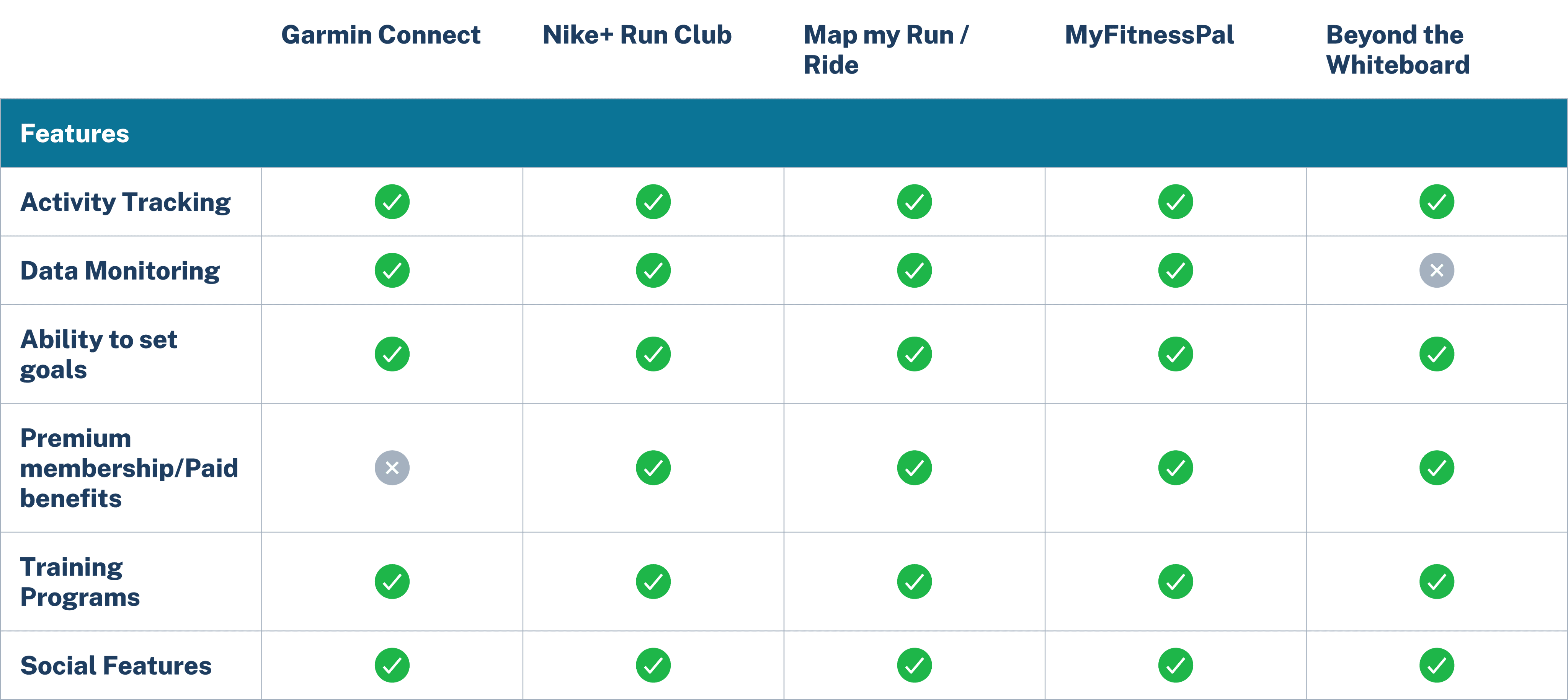
Competitive Analysis
I started by analyzing 5 digital fitness services to get an understanding of what solutions were on offer. I mostly looked at similar GPS-tracking apps, but decided that I wanted to include a diet- and weight training tracker to get a broader sense of offerings.
I started by analyzing 5 digital fitness services to get an understanding of what solutions were on offer. I mostly looked at similar GPS-tracking apps, but decided that I wanted to include a diet- and weight training tracker to get a broader sense of offerings.
User Survey and Interviews
I conducted a round of user interviews and a survey to understand general fitness habits, and to see if they needed a more structured and informed approach to their training.
I conducted a round of user interviews and a survey to understand general fitness habits, and to see if they needed a more structured and informed approach to their training.
Survey
33 Participants
Age 20s - 40s
Shared on local running club- and Crossfit Facebook group
33 Participants
Age 20s - 40s
Shared on local running club- and Crossfit Facebook group
User interviews
4 Interviewees
Age group late 20s - early 30s
Relatively active participants
4 Interviewees
Age group late 20s - early 30s
Relatively active participants
Sharing tasks
Goals
Information
Motivation
Needs
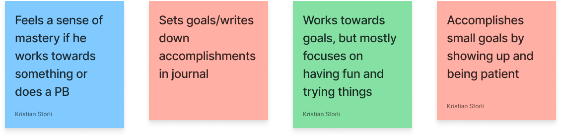
A majority of the participants were goal driven
Most participants were consistent in their training, even during difficult periods
Most participants followed a plan, while others based their sessions on mood or feel
Most participants used apps to track their training or nutrition
A majority of the participants were goal driven
Most participants were consistent in their training, even during difficult periods
Most participants followed a plan, while others based their sessions on mood or feel
Most participants used apps to track their training or nutrition
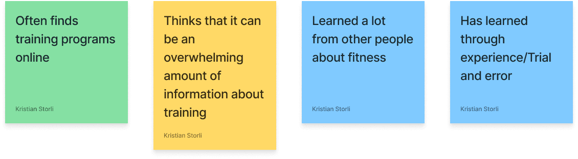
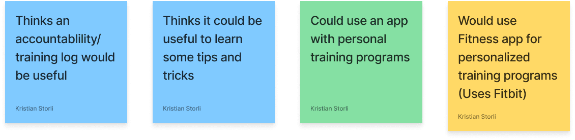
Some participants stated that there are an overwhelming amount of information about training and fitness
Several Participants stated that having some sort of accountability or program would be beneficial
Some participants stated that there are an overwhelming amount of information about training and fitness
Several Participants stated that having some sort of accountability or program would be beneficial
Define
Personas, Questions and Statements
To aid my research feedback, I created a persona that represented the participants' common motivations and pain points.
To aid my research feedback, I created a persona that represented the participants' common motivations and pain points.
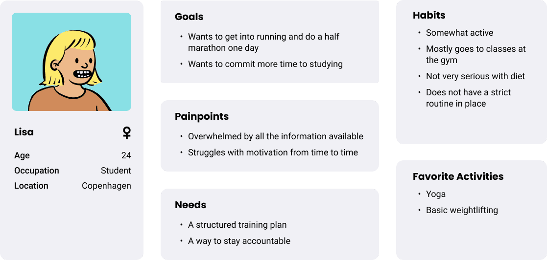
The persona would allowed me to generate several How Might we questions and POV Statements for my ideation and design process.
The persona would allowed me to generate several How Might we questions and POV Statements for my ideation and design process.
How might we
How might we help users to train for goals without losing motivation?
How might we help beginners find suitable training plans easily?
How might we use Strava as a platform to find and use training plans?
How might we help users to train for goals without losing motivation?
How might we help beginners find suitable training plans easily?
How might we use Strava as a platform to find and use training plans?
Point of view
I´d like to explore ways that users can easily stick to a training plan
I´d like to explore ways users can pursue certain goals with Strava
I´d like to explore ways that users can easily stick to a training plan
I´d like to explore ways users can pursue certain goals with Strava
Ideation
Feature Set
After defining personas, HMWs and POVs, I came up with several features that would give a better picture of what to include in my design. Due to time constraints, my focus was on creating an MVP, meaning that I would only focus on the must have´s and a few of the could have´s.
After defining personas, HMWs and POVs, I came up with several features that would give a better picture of what to include in my design. Due to time constraints, my focus was on creating an MVP, meaning that I would only focus on the must have´s and a few of the could have´s.
Must have
Training Programs
Training Programs
Helps users train for specific goals
Helps users train for specific goals
Progress Tracking
Progress Tracking
A way for users to track progress and goals
A way for users to track progress and goals
Should have
Recovery Tracking
Recovery Tracking
Shows different categories of tasks
Shows different categories of tasks
Post-session Feedback
Post-session Feedback
Built in feature to help with time Scheduling
Built in feature to help with time Scheduling
Could have
Tutorials
Tutorials
Video/Written tutorials about technique/Recovery/Diet
Video/Written tutorials about technique/Recovery/Diet
Guided Run
Guided Run
Guides and gives feedback based on your current session
Guides and gives feedback based on your current session
“Won´t” have
Training Reminder
Training Reminder
Optional Feature that continually reminds you to stay active
Optional Feature that continually reminds you to stay active
Direct Messaging
Direct Messaging
A direct message feature that lets you connect with others
A direct message feature that lets you connect with others
Due to time limit constraints and to avoid further scope creep, I focused on the “Must-Have´s” going forward.
Due to time limit constraints and to avoid further scope creep, I focused on the “Must-Have´s” going forward.
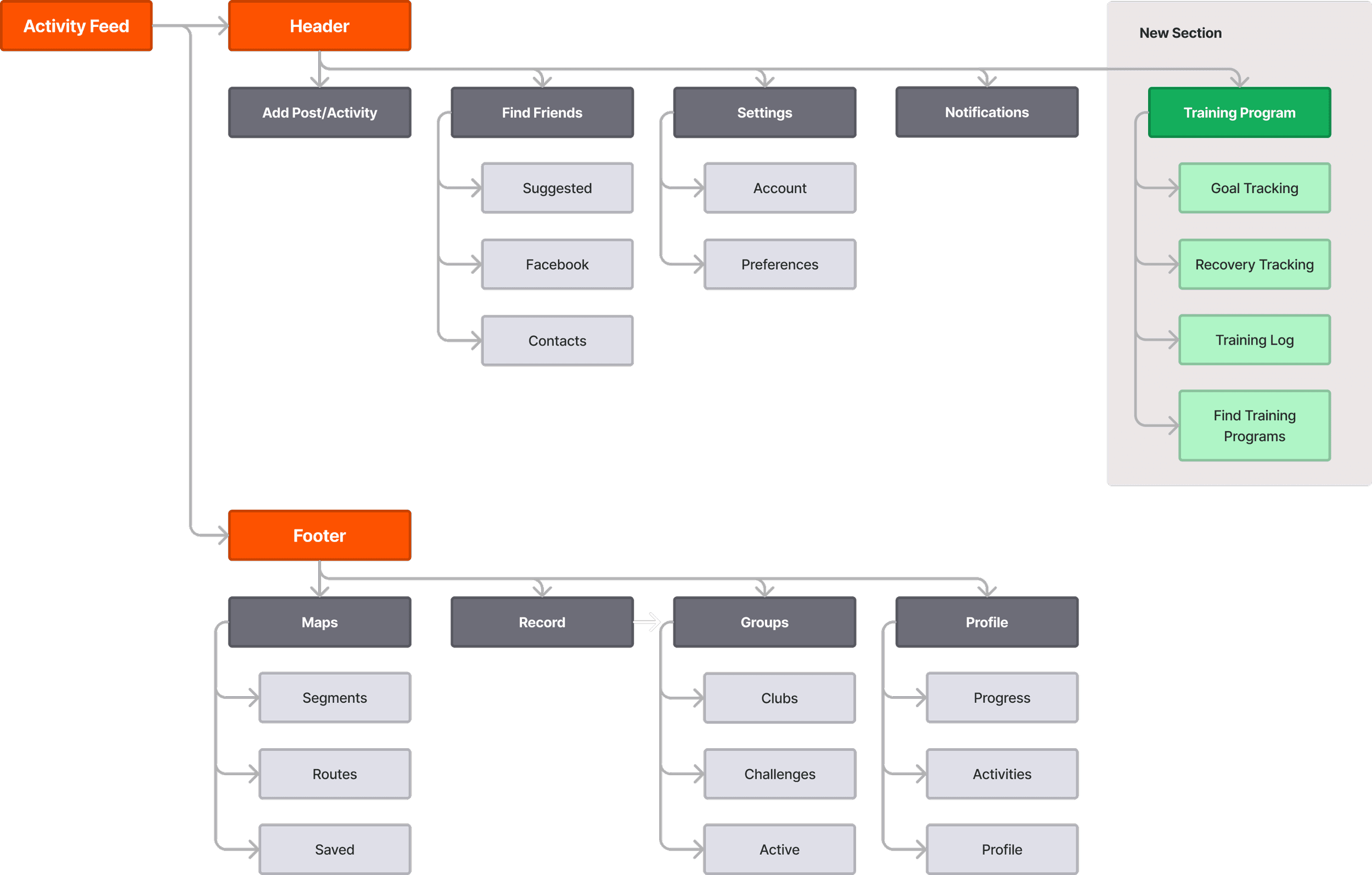
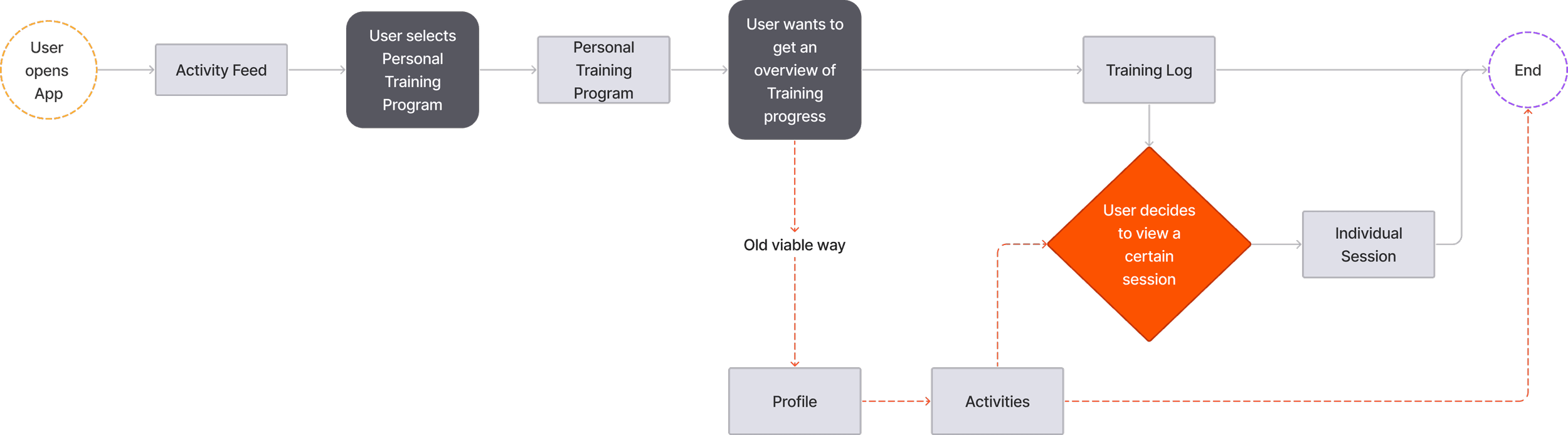
Sitemap
User Flows
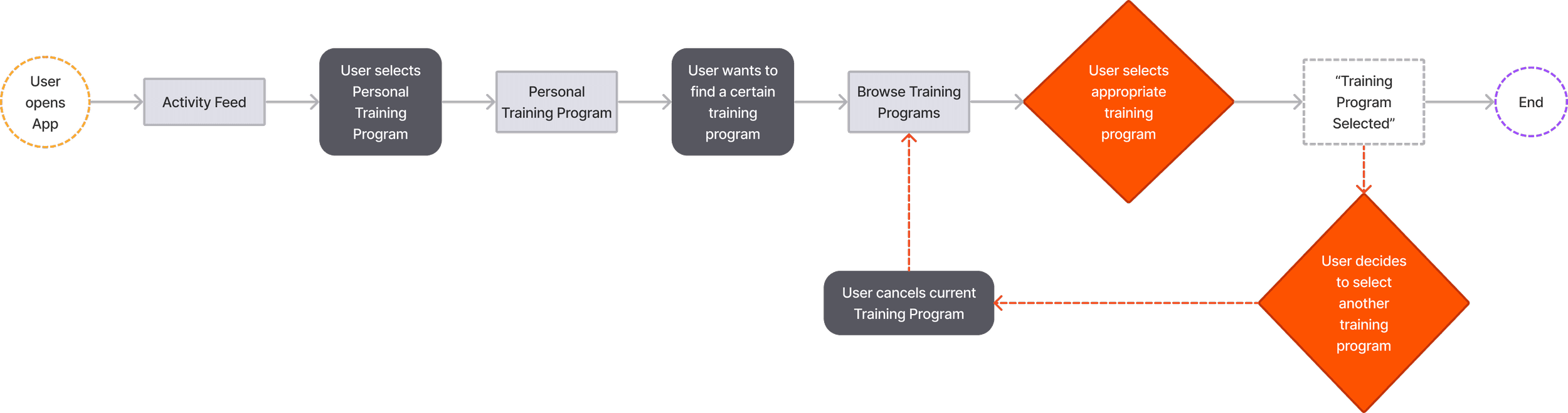
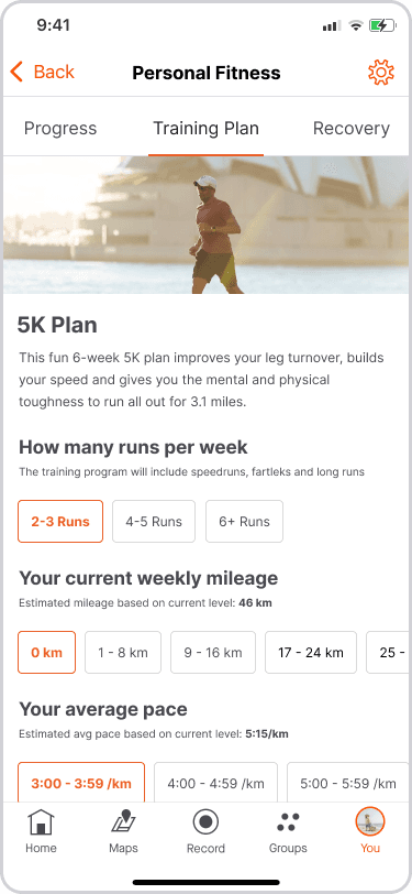
Selecting training program
Viewing Training Progress
Design
Early Wireframes
With an already established design system, implementing the potential features proved more challenging than expected.
With an already established design system, implementing the potential features proved more challenging than expected.
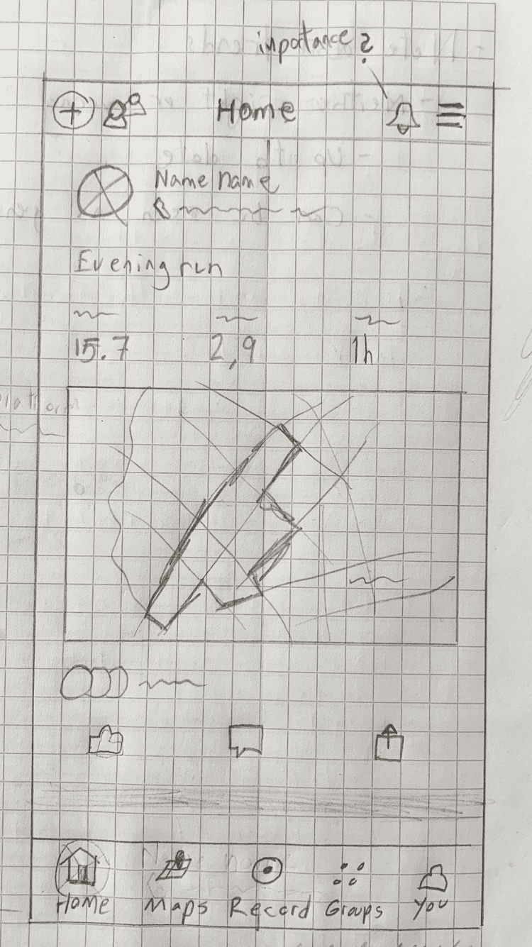
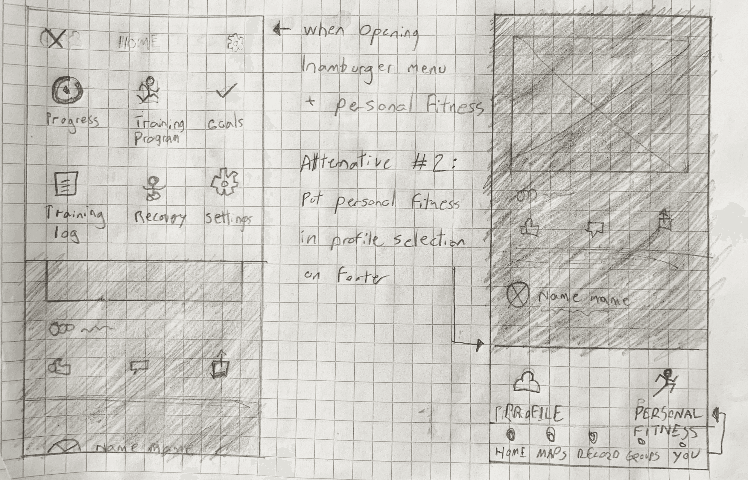
One of the ideas I had was to add a pop-up menu, to select the Training Program feature. However, I quickly discarded the idea as it felt too out of place with Strava´s existing design.
One of the ideas I had was to add a pop-up menu, to select the Training Program feature. However, I quickly discarded the idea as it felt too out of place with Strava´s existing design.
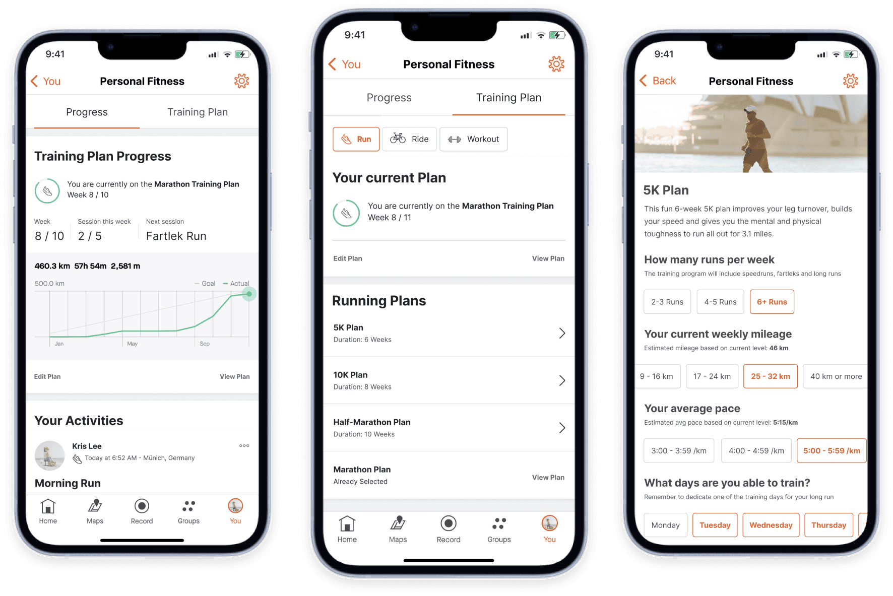
High Fidelity Wireframes and Prototype
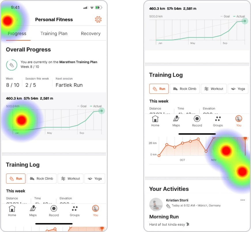
On the profile page, I added a new section for the training plan feature. I rebranded it Personal Fitness.
On the profile page, I added a new section for the training plan feature. I rebranded it Personal Fitness.
Profile w/added section
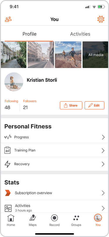
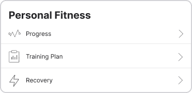
Personal Fitness
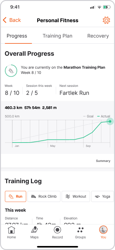
Training Plans
Training Plan Setup
Branding
Strava is Swedish for “strive”
Strava defines their users as “Athletes”
Orange is the primary brand color. It is commonly used to draw attention to key elements or actions.
Maison Neue is the primary typeface for Strava. As this is a licensed type family, this project uses Inter which is similar in its structure and design
Strava mainly uses an 8-point grid design. Smaller elements can be aligned to a 4-point grid
Testing
Test Summary
Remote Tests
5 Participants
15-30 min sessions
Remote Tests
5 Participants
15-30 min sessions
Test flows
Set up a 5K Running plan
Find training log feature
Set up a 5K Running plan
Find training log feature
Success Metrics
Participants can still navigate the app intuitively
Participants can complete the tasks within 3 minutes with little to no errors
Participants provided positive feedback and/or would consider using the app
Participants can still navigate the app intuitively
Participants can complete the tasks within 3 minutes with little to no errors
Participants provided positive feedback and/or would consider using the app
Key Takeaways
Some participants struggled with completing the two tasks.
Most of the participants found the first task somewhat easy, yet struggled with the second due to confusing selection options and lack of consistency within the design.
Some participants were a bit overwhelmed with the amount of features shown.
Participants found the feature useful, and some would even consider using it if it were available
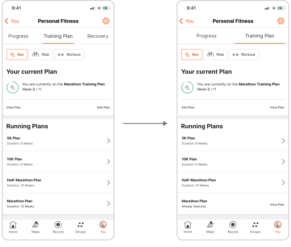
Design Reiterations
Selected training program highlighted throughout the design for better consistency
Changed the order of the progress page based on importance
Removed Recovery section due to overall scope creep
Selected training program highlighted throughout the design for better consistency
Changed the order of the progress page based on importance
Removed Recovery section due to overall scope creep
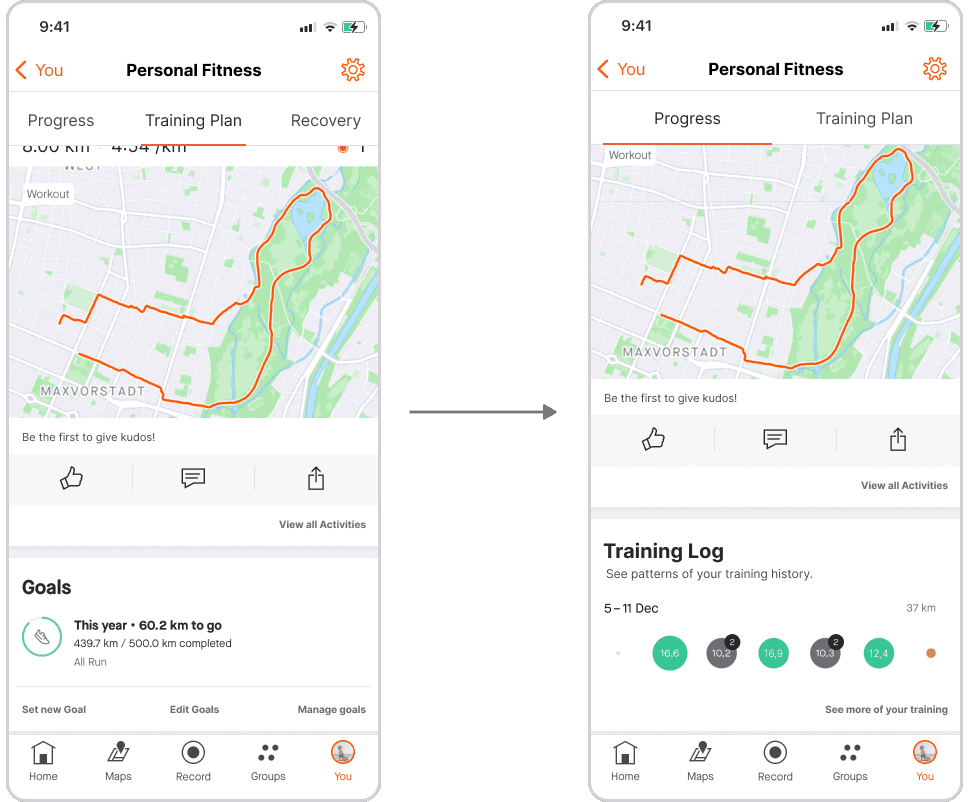
Changed the Training log section to avoid confusion with the existing Activity section.
Removed the already existing Goal Feature, as it had no purpose along with the new design solution
Added an “Overwrite” Prompt when starting a new program
Fixed minor visual details
Changed the Training log section to avoid confusion with the existing Activity section.
Removed the already existing Goal Feature, as it had no purpose along with the new design solution
Added an “Overwrite” Prompt when starting a new program
Fixed minor visual details
Conclusion
Opportunities
Consider push reminders to remind users to be active. Note that this might go against Strava´s goal of keeping users undistracted
Consider push reminders to remind users to be active. Note that this might go against Strava´s goal of keeping users undistracted
Strava already has a rudimentary goal feature. This could be fleshed out or incorporated with the training plan feature.
Strava already has a rudimentary goal feature. This could be fleshed out or incorporated with the training plan feature.
According to the user research, several participants would like a way to learn about certain topics.
According to the user research, several participants would like a way to learn about certain topics.
Incorporating Recovery- and Sleep tracking features. These features could be beneficial for Strava´s users
Incorporating Recovery- and Sleep tracking features. These features could be beneficial for Strava´s users
A coaching feature. Apps like Nike Run Club and From Couch to 5K have interactive coaches. Implementing an interactive coach could benefit beginners who struggle with motivation or drive
A coaching feature. Apps like Nike Run Club and From Couch to 5K have interactive coaches. Implementing an interactive coach could benefit beginners who struggle with motivation or drive
Personal Takeaways
When implementing a feature into an existing product, you have to consider the ethos and goal of the design itself. The design team may also have discussed the same ideas as you at some point. For whatever reason, they discarded the ideas or realized they were unsuitable.
The time cap for this project was 80 hours. Due to other circumstances, I was not able to focus on this project in a consistent manner. Constantly revisiting a project like this proved challenging. Having a structure and clear personal design system is essential. Not only for yourself but also for others.

© 2024 Kristian Storli
© 2024 Kristian Storli