Roasthero
MVP Case Study
Role
Product research, Web Design, Validation, Conversion Rate Optimnization
Platform
Desktop (Responsive)
Tools
Figma, Framer, X (Twitter), Stripe, Meta Ads
Duration
1 week
Background
Back in June of 2024, I started sharing my design work and explorations on X /Twitter. The goal was to connect with other designers and look for potential work opportunities.
I came across the concept of design roasting. This was a brilliant opportunity to get inbound leads, while getting in touch with other Designers and gaining valuable experience.
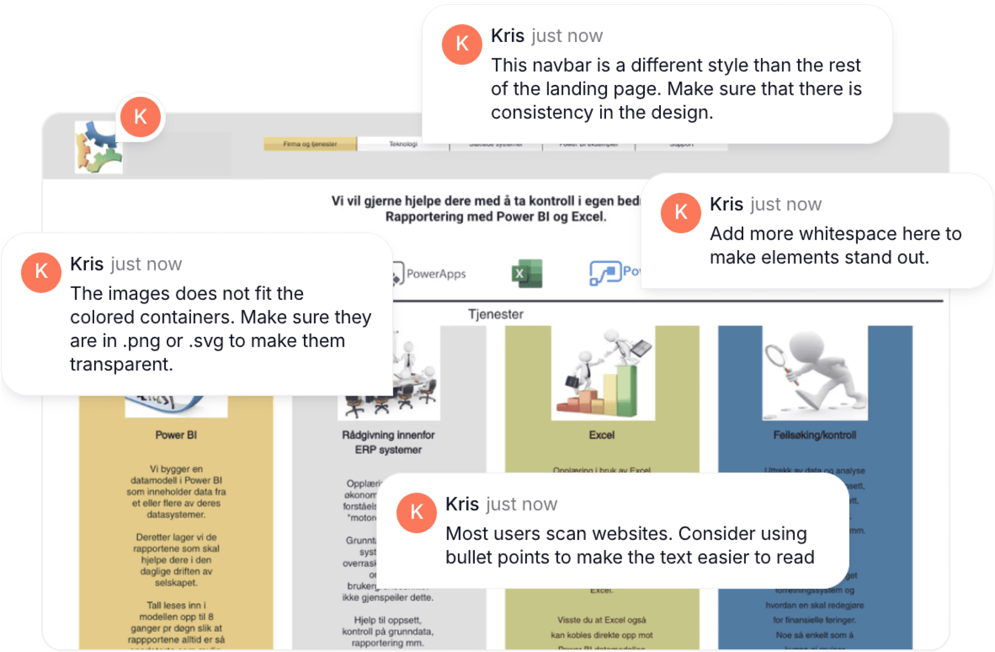
I looked at certain community groups like #Buildinpublic and #indiehackers to see if I could find websites to redo. My focus was mainly on redoing the CTA, and the copy above the fold. I would also explain why I made the design decisions I did.

After doing design roasts for a while, I noticed that a lot of founders were grateful for the redesigns, but weren´t interested in paying for a full-blown redesign.
Hence, the idea of productizing design roasts came to be.
Creating an offer
Competitive Analysis
Seeing as users would ask for roasts for free, I wanted to have a more value-packed offer. To get a better overview, I looked into similar services that offered this type of service.
Two of the ones that stuck out the most were:
Competitors
Description

Offers video roast made by a CRO expert
Flat rate of $350

Offers a Figma file containing audit, as well as video audit and Q&A call
Several purchase options, ranging from $99 to $499
The offer
Based on my own design roasts and what some the competitors were doing, I decided to offer Figma files containing extensive audits for my customers.
To sell the offer, I needed a landing page leading to a Stripe payment link. For the landing page, I went with Framer. Although a bit more complicated, it gave me freedom to design the page how I wanted it.
I quickly set up a Stripe payment page, where I included the following input fields:
Email
Landing page URL
What is your main conversion goal?
I set the price to a fair $29.00 to test, based on what the customers would get.
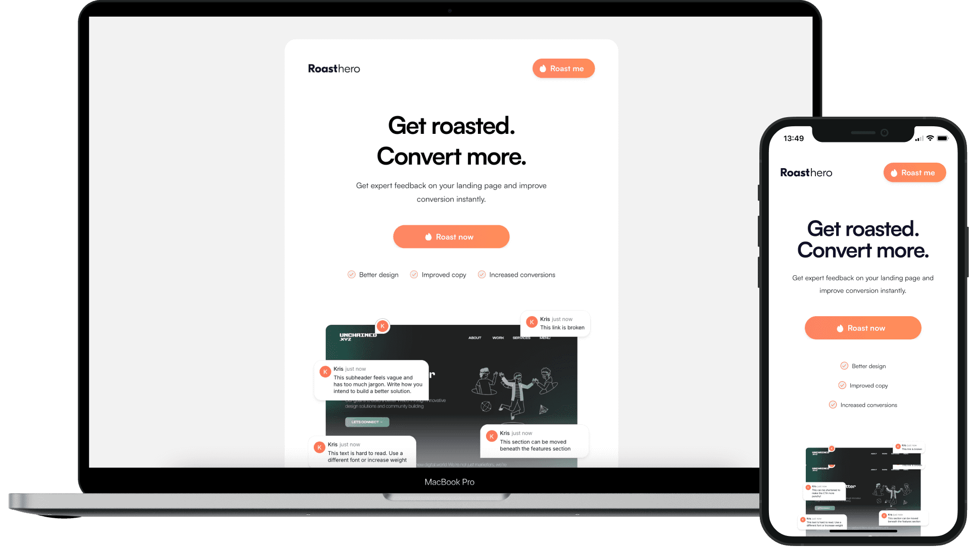
Layout
Copy and layout
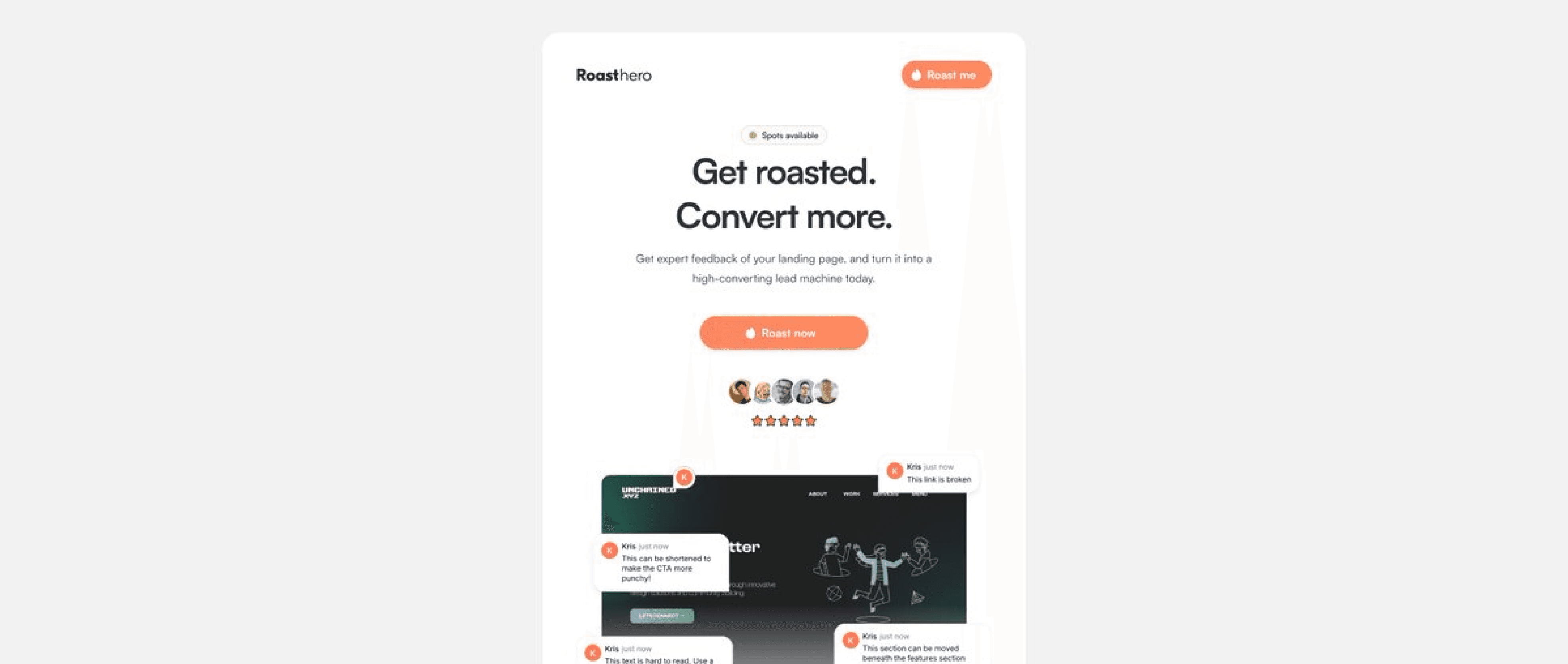
For the copy, I wanted to have a straight to the point CTA section with a striking title and easy to understand sub-headline. It was important to keep everything the customer needed to know above the fold.
I used bullet points to easily showcase the benefits of using the service, along with imagery to demonstrate it. I would also make sure that the CTA buttons were consistent throughout the page for whenever a customer wanted to take action.
Design
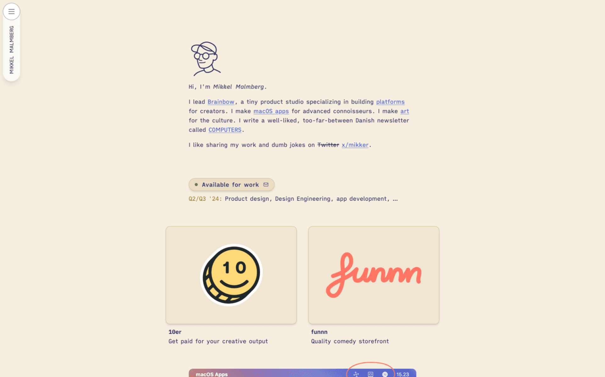
For the design of the landing page, I drew a lot of inspiration from sites like tiny.supply and Mikkelmalmberg.com. I wanted the slim layout to highlight the copy and content, simplifying the customer journey. Coincidentally, This worked well across multiple platforms.
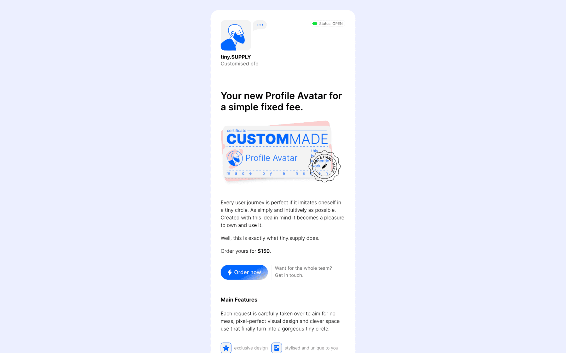
For the design itself, I experimented with various color combinations for the CTA buttons, background and the main container. For the CTA, I opted for a striking orange color, with a white content container and a grey background, similar to tiny.supply.
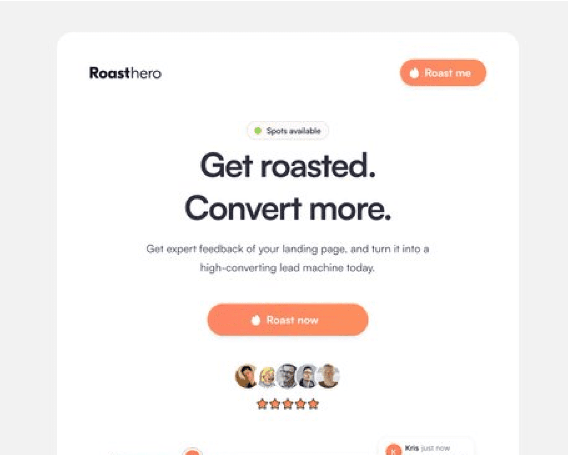
First version
Research and validation
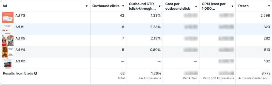
To quickly validate, I used Meta ads. I created two ad sets with 3 ads each. The goal was to run the ads for 5-6 days, continually eliminating ads that were underperforming.
At first I gained a lot of views and clickthroughs, but no conversions. After 6 days, I got my first customer and concluded that I should launch the service.
Feedback and social proof
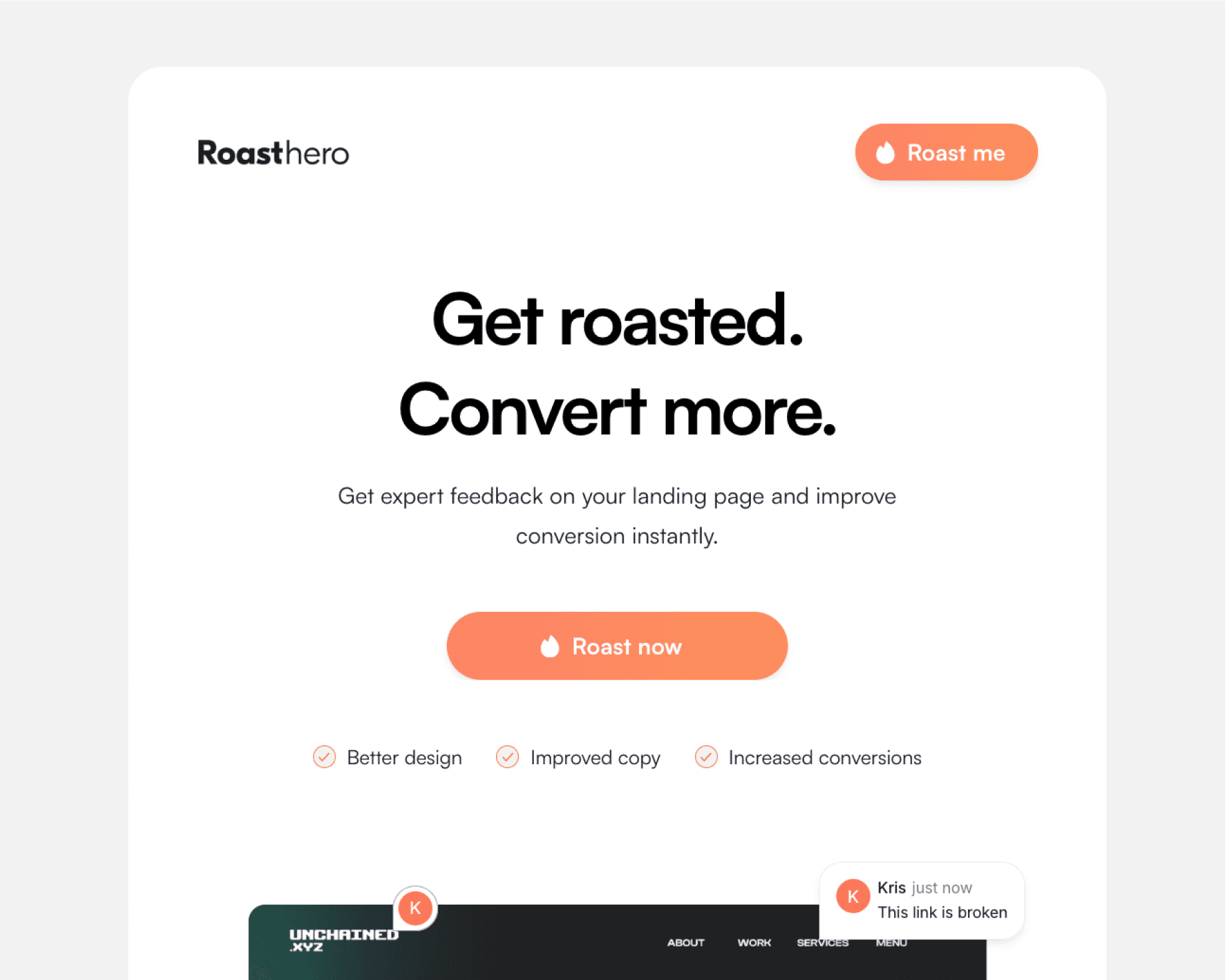
Even after launch, I still sought feedback from other designers and founders. I would ask them what worked and what could be improved on the landing page. The common answer I got was that the landing page lacked social proof.
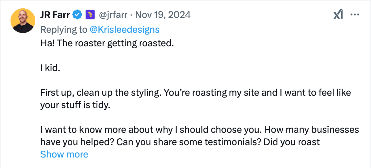
To address this, I asked on X if anyone needed a free design roast for their landing page. In exchange, I would get testimonials I could use on my page.
I also made tiny adjustments to the information displayed above the fold, to better showcase what was on offer.
Before
After
Conclusion
The Result
Roasthero is a digital service that delivers a thorough audit of your landing page that highlights pain points and provide you with actionable feedback that helps you convert more.
Roasthero looks at three key elements: Design, user experience and copy. After booking a roast, the customer receives a Figma file that contains everything they need to improve their landing page, all within 48 hours
A perfect alternative to those that want to improve their landing page, but aren´t able to afford a full-time Web Designer or Marketer.
Note:
Roasthero is still an ongoing project. In terms of conversion rate, the landing page is being tweaked and optimized regularly.
Opportunities
The offer itself is quite simple. One opportunity to consider is to give more service offerings like video roasts, personal calls, hero redesigns, etc.
Services like https://www.roastd.io/ offer roasts in a brutally honest way. This has made me reconsider how I want to deliver my roasts for my customers. This could make the service stand out more, creating a better USP.
Backlinks and traffic. Launching Roasthero on sites like Producthunt and similar directories can help boost Roasthero´s backlink profile. This would lead to increased traffic and potentially higher conversion.
Personal Takeaways
If I were to do this again, I would focus less on designing a perfect landing page, and test the idea using a simpler solution like Carrds or Squarespace.
Even though I gained a few customers early, I would consider doing a more thorough validation to make sure that there was actual demand. building this, I realize there is potential, but I still need to refine my copy and my product more.
I decided to choose Meta ads as a validation tool. Validation through paid ads can be great, but doesn´t provide in-depth feedback. Not to forget, you have to pay more to get better results.
Ironically, having a landing page that offers a roasting service, still requires constant iterations. You still need feedback from others to perfect your solution.