Capstone UI/UX case study
Allowing users to post small jobs and find suitable helpers
Role
UX Research, Testing, UX/UI Design
Platform
Mobile (IOS)
Tools
Figma, Maze, Google Forms, Old notebook and pencil
Duration
6 Weeks (80 hours total)
Background
Solution
Empathize
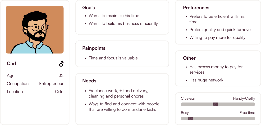
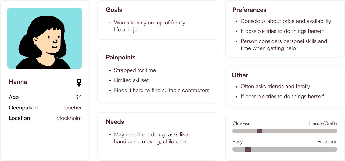
Main Research Goals
User Survey and Interviews
Example Questions
What are examples of tasks that you would need help with?
How do you reach out to someone?
What are your experience with paying someone else to do a job for you?
Tell me about a time you had very specific problem you needed to fix, and how you dealt with it?
Key Insights

Main Takeaways
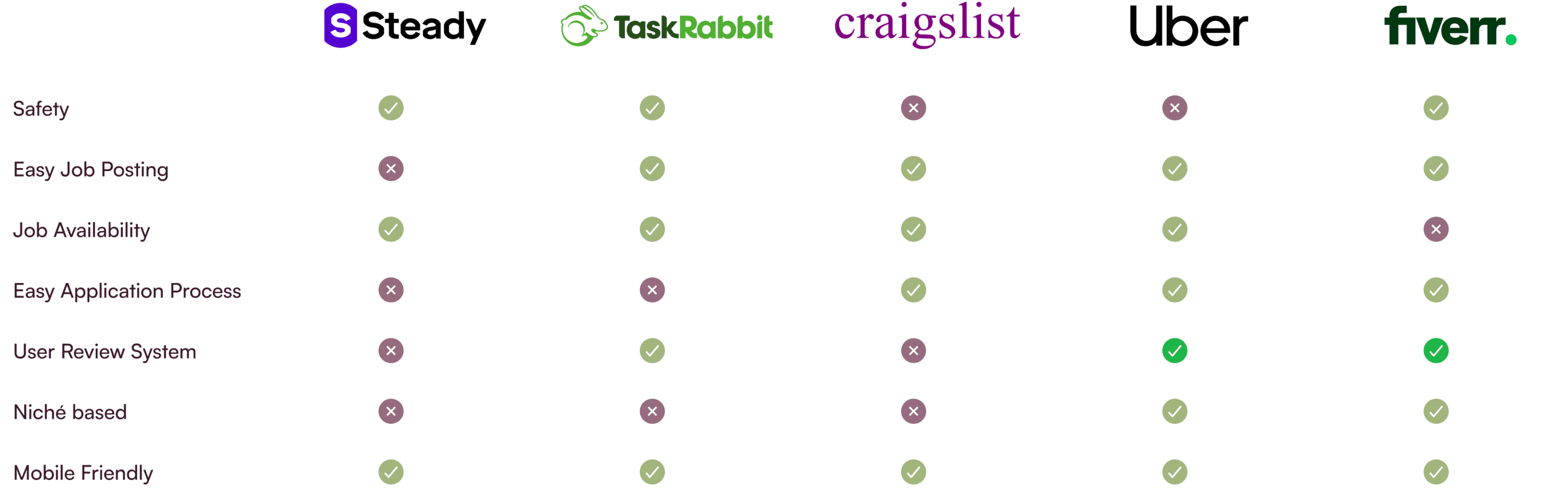
Competitive Analysis
Define
1
2
HMW questions and POV statements
How might we
Help people decide what to do and who to contact?
Tell whether a task is difficult or requires specialized expertise?
Help users free up time?
Point of view
I´d like to explore how users can find helpers and contractors
I´d like to explore how users can share jobs
I´d like to explore ways users and helpers can communicate effectively
Ideation
Feature Set
Must have
Browse
Shows all Helpers
Search
Search for relevant Helpers
Sort/Filter
Way to sort between different categories and criterias of work or helpers
Rating System
A way to see and read about previous experiences with helpers
Direct Message
Way to direct message users and helpers
Price
Shows price of service offered by Helper
Tags
Way to tag by professionalism or type of work
Post Task
A way users can post tasks or jobs that need to be done
Description
Description of what needs to be done
Upload Image
Upload images of the task or what needs to be done
Notifications
A way to get notified when new Helpers post or responds
Could have
Category
Shows different categories of tasks
Schedule Time
Built in feature to help with time Scheduling
Feedback
Way for users to give feedback and rate helpers
Qualifications
A way for Helper to show their qualifications (Eg. Certified carpenter etc.)
Set Availability
Helps users set up when you are available for doing jobs/Getting help
Budget
Select budget users are willing to pay for tasks
Nice to have
Response Time
See how quickly a helper is able to respond to DM
Favorite
Shows favorite helpers (Selection-based)
Past Helpers
Show helpers that users have used in the past
Professional Level
Shows what level of professional a helper is (Eg. Novice, or certified Professional)
Can come later
To-do List
A way for users to track all tasks that need to be done
Task Flows
Post task

Cancel task

Browsing helpers
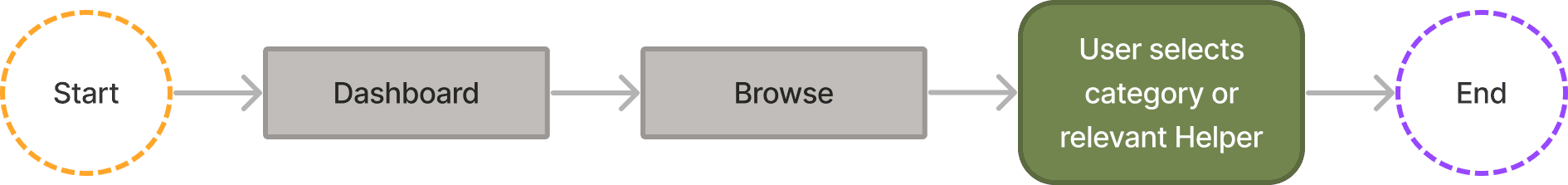
Messaging a helper

Responding to a helper

Empathizing
Early Wireframes
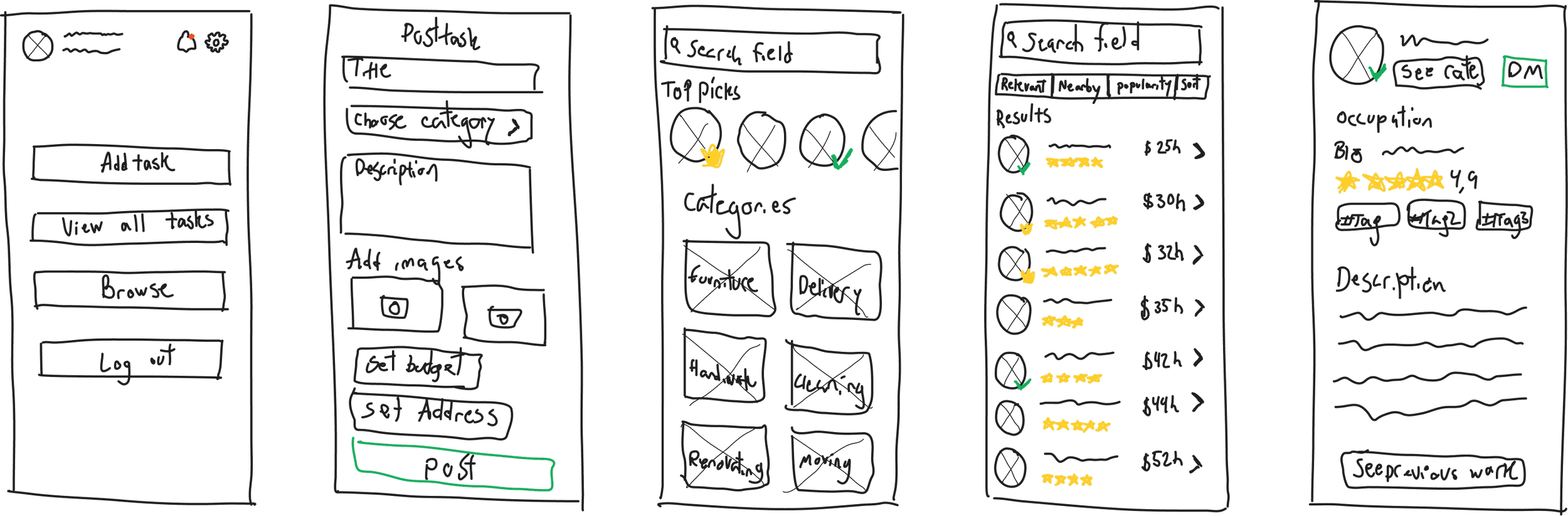
UI elements
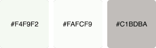
Color Palette
Primary

Primary

Neutral
Logo
Large
Typeface
Header 1
Helvetica Bold 24
Header 2
Helvetica Bold 20
Header 3
Helvetica Bold 18
Button
Helvetica Regular 16
Body 1
Helvetica Regular 14
Body 2
Helvetica Regular 12
Icon Set
Navigation
Categories
Bottom Nav
Other
Upload
Social Proof
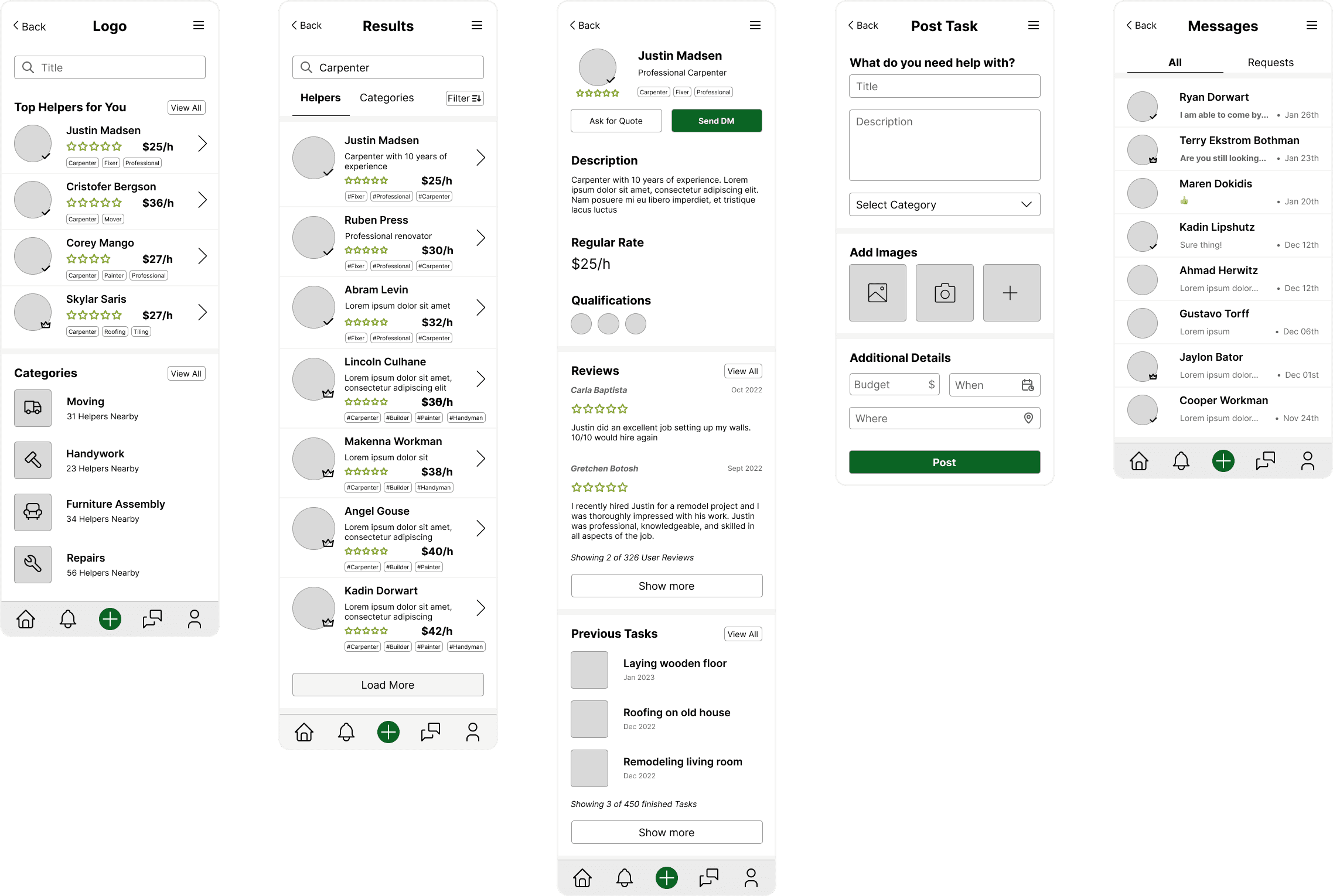
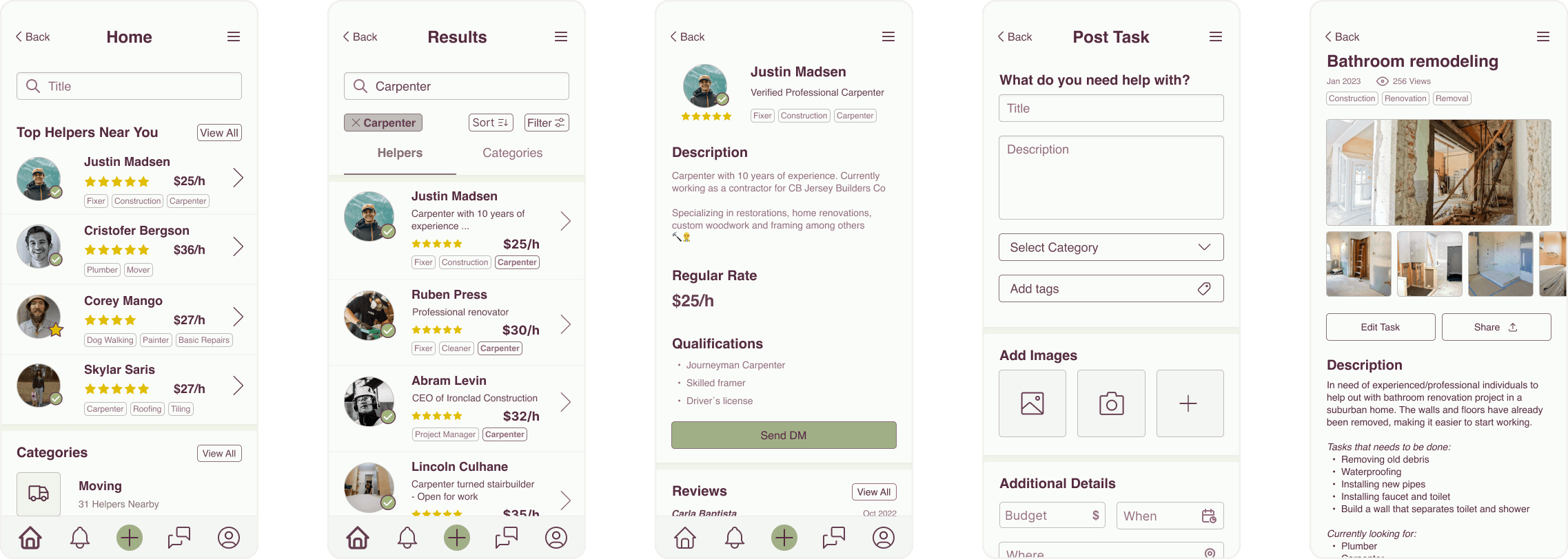
High Fidelity Wireframes
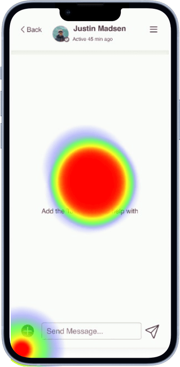
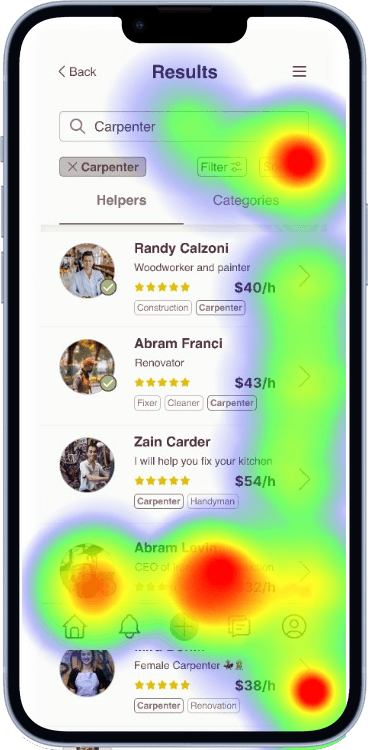
Testing
1st Usability Test
2nd Usability Test
“I think the layout and navigation uses common design patterns which made it fairly easy to navigate. The color palette is great as well.”
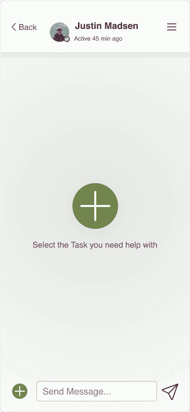
“The prompts "share" and "add" was a little confusing because they were inconsistent. If I'm "adding" the bathroom project, it should be the button should say "add" not "share"?"
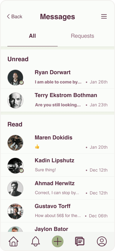
"in the message box, it was hard to notice which ones were "new /unread"
Key Takeaways
Reiterations
Notifications
Before
After
Before
After
Sharing tasks
Helper Cards
Before

After

Minor Iterations
Conclusion
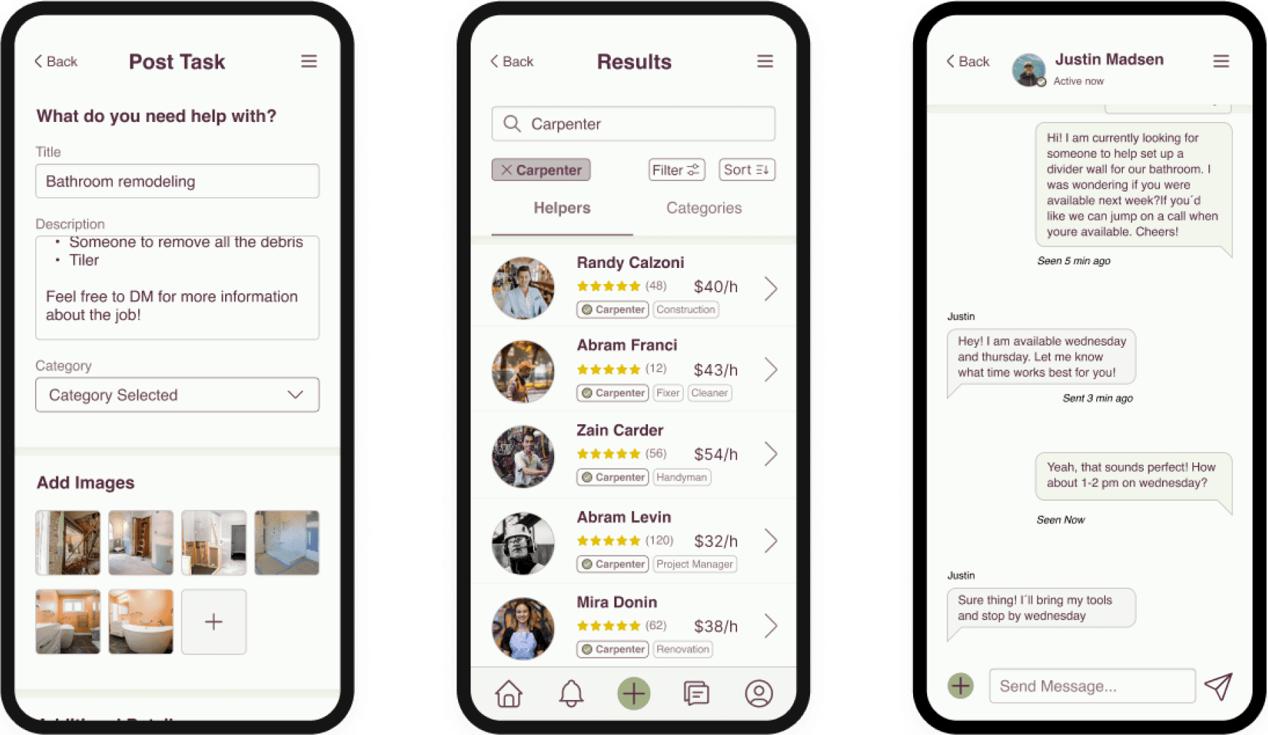
Final Version
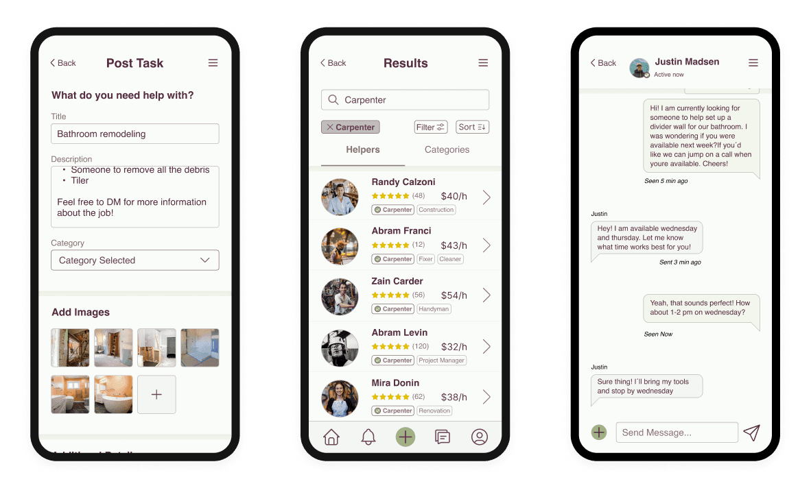
1. Post your task
2. Find a suitable helper
3. Plan the details
4. Kick back 🧘♂️