Budgetflow
Capstone UI/UX case study
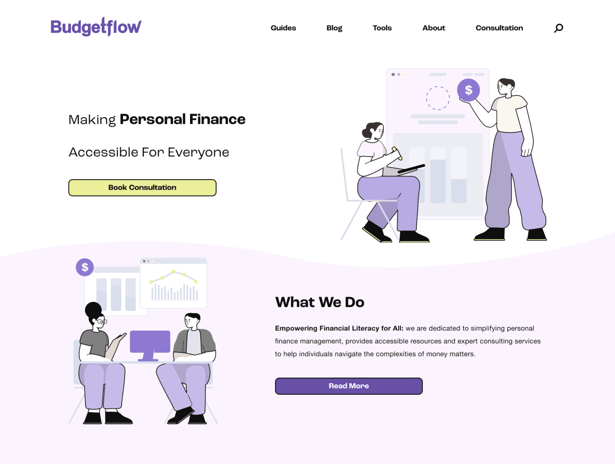
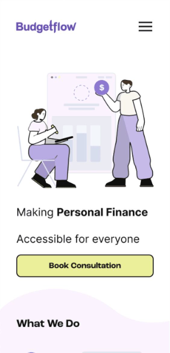
Making personal finance more approachable
Making personal finance more approachable
Problem
There is a common consensus that people lack knowledge about financial literacy. With an overwhelming amount of information available, knowing how to approach the subject can often feel daunting.
There is a common consensus that people lack knowledge about financial literacy. With an overwhelming amount of information available, knowing how to approach the subject can often feel daunting.
Solution
Budgetflow offers a platform that allows users to delve into topics regarding personal finance and financial literacy. Their goal is to provide well-made, expertly crafted resources like articles, guides, and consulting services.
Budgetflow offers a platform that allows users to delve into topics regarding personal finance and financial literacy. Their goal is to provide well-made, expertly crafted resources like articles, guides, and consulting services.
Empathizing
Research
In order to understand how people perceive financial literacy, I decided to start my research phase by doing a survey and a round of user interviews. My goal with the research was to look into participants’ lifestyle and financial habits, before understanding how they taught themselves personal finances.
In order to understand how people perceive financial literacy, I decided to start my research phase by doing a survey and a round of user interviews. My goal with the research was to look into participants’ lifestyle and financial habits, before understanding how they taught themselves personal finances.
Research Insights
Based on 31 survey participants and 5 user interviews, I were able to reveal the following insights:
Based on 31 survey participants and 5 user interviews, I were able to reveal the following insights:
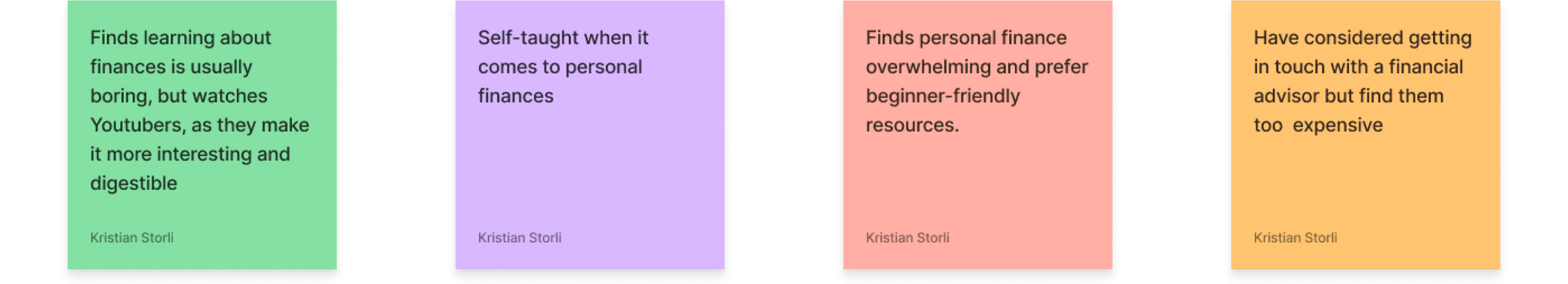
Participants were mindful of their spending habits.
Some participants found investing intimidating.
Participants learned about finances through books, Reddit, social media-content, and podcasts.
Several participants considered using a financial advisor, but found them too expensive.
Almost all participants were open to learning about personal finances
Competitive Analysis
Alongside the primary resarch, I wanted to look at similar solutions that provided monetary services and financial resources:
Alongside the primary resarch, I wanted to look at similar solutions that provided monetary services and financial resources:
Competitors
Description
A platform that provide users with tools, expert advice, and educational resources
A platform that provide users with tools, expert advice, and educational resources
A platform that offers articles, tutorials, and videos on financial topics
A platform that offers articles, tutorials, and videos on financial topics
Provides business news and insights through an easily digestible newsletter
Provides business news and insights through an easily digestible newsletter
Offers a range of products ment to educate people on personal finance, investing, and business
Offers a range of products ment to educate people on personal finance, investing, and business
One of the main takeaways I got, was that Personal Finance education is a large niche. This further proves the point that looking for information can feel like a daunting task.
One of the main takeaways I got, was that Personal Finance education is a large niche. This further proves the point that looking for information can feel like a daunting task.
Define
Define
With our research and newly discovered pain points in mind, how should we tackle our project moving on?
With our research and newly discovered pain points in mind, how should we tackle our project moving on?
How might we
…Make it easier for people with little to no experience to learn about
personal finances?
…Make it easier for people with little to no experience to learn about personal finances?
…Offer intuitive solutions that people can learn from?
…Offer intuitive solutions that people can learn from?
…Help people that are knowledgeable about finances, but wants to learn specific topics?
…Help people that are knowledgeable about finances, but wants to learn specific topics?
I would need to explore ways that people could access valuable information, while also get in touch with experienced professionals in an easy and accessible way.
I would need to explore ways that people could access valuable information, while also get in touch with experienced professionals in an easy and accessible way.
Ideation
Ideation
Information Hierarchy & Task Flows
Although my research revealed certain user habits and pain points, I was still not sure how I would structure a potential solution. Based on a hybrid card sort with 10 participants, I was able to craft an organized sitemap I could build upon.
Although my research revealed certain user habits and pain points, I was still not sure how I would structure a potential solution. Based on a hybrid card sort with 10 participants, I was able to craft an organized sitemap I could build upon.
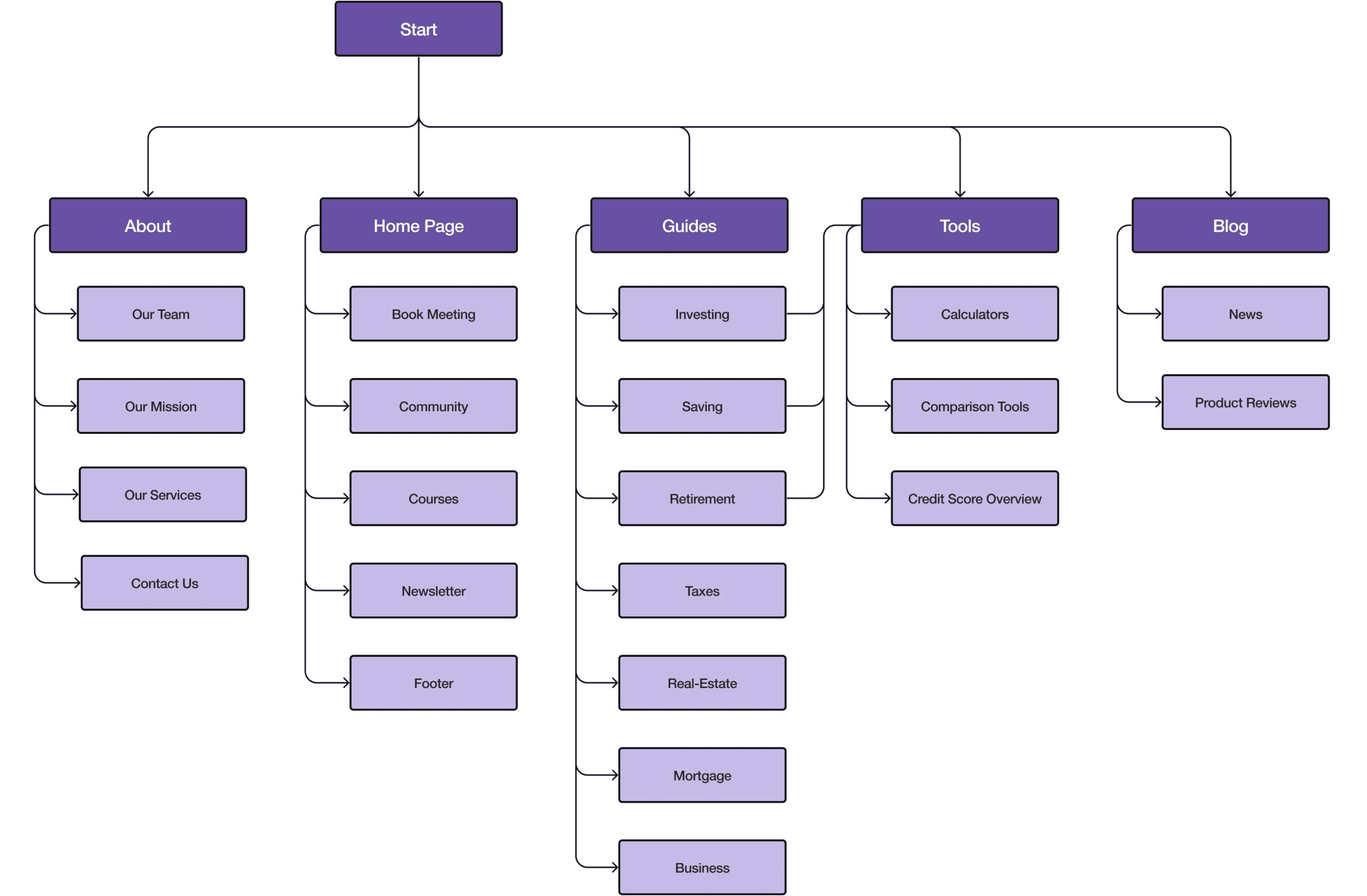
One of the considerations I had to keep in mind, was that finding information about various topics can be a very complex and individual experience, To showcase different paths a user could take, I created several task flows that showed how users could find relevant financial topics:
One of the considerations I had to keep in mind, was that finding information about various topics can be a very complex and individual experience, To showcase different paths a user could take, I created several task flows that showed how users could find relevant financial topics:
Find information about investing


Book a meeting with an expert

Design
Design
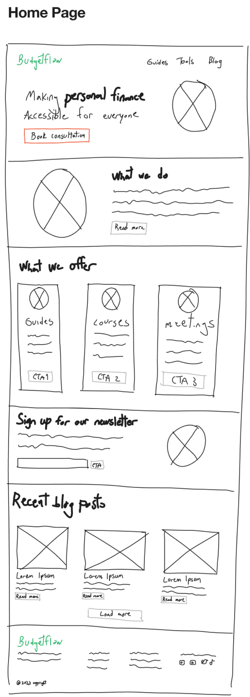
Early Wireframes
For the wireframes, I based my designs on the hierarchy of importance highlighted by the sitemap and the flows.
I also considered what could be best in order to keep viewer retention when users navigated the site. This is something I would need to test further.
For the wireframes, I based my designs on the hierarchy of importance highlighted by the sitemap and the flows.
I also considered what could be best in order to keep viewer retention when users navigated the site. This is something I would need to test further.
Branding
For the visual style, the Budgetflow team wanted something that felt accessible yet exclusive for their branding. We landed on a color scheme of yellow and purple, which conveyed exclusivity and learning.
For the visual style, the Budgetflow team wanted something that felt accessible yet exclusive for their branding. We landed on a color scheme of yellow and purple, which conveyed exclusivity and learning.
Primary
8D77D2
C6BBE8
6750A4
Primary
FFF9BF
FFFCE1
EBEF99
Neutral
F9F7F0
FBF4FF
FFFFFF
EBECF2
101010
Other
FF0000
04C200
FF8A00
For the type face, we decided to go for Helvetica Neue which was easy to read, yet had its own distinct character. Roc Grotesk was used as a header type for its trendy neo-brutalist features.
For the typeface, we decided to go for Helvetica Neue which was easy to read, yet had its own distinct character. Roc Grotesk was used as a header type for its trendy neo-brutalist features.
Desktop
H1: Roc Grotesk - Bold 32
H2: Roc Grotesk - Bold 24
Button: Roc Grotesk - Bold 18
Body: Helvetica Neue - Regular 16 (2% spacing)
Tags: Helvetica Neue - Regular 12 (2% spacing)
Mobile
H1: Roc Grotesk - Bold 24
H2: Roc Grotesk - Bold 20
Button: Roc Grotesk - Bold 16
Body: Helvetica Neue - Regular 14 (2% spacing)
Tags: Helvetica Neue - Regular 12 (2% spacing)
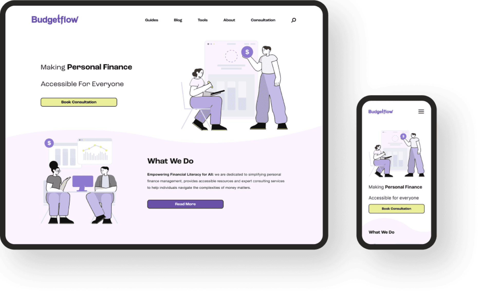
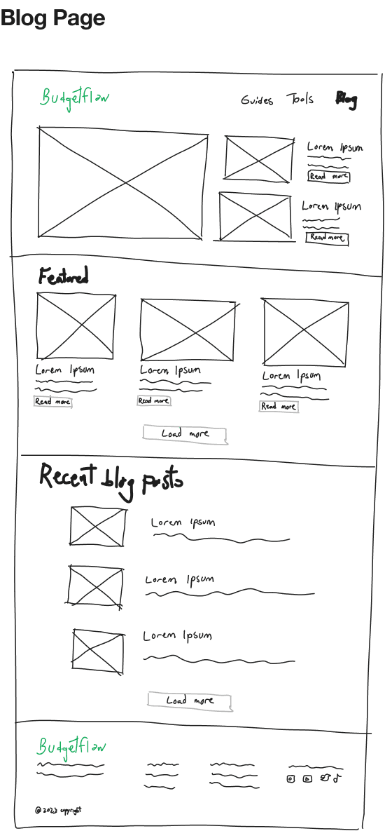
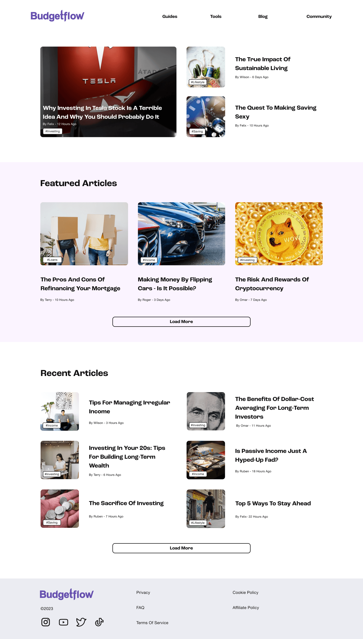
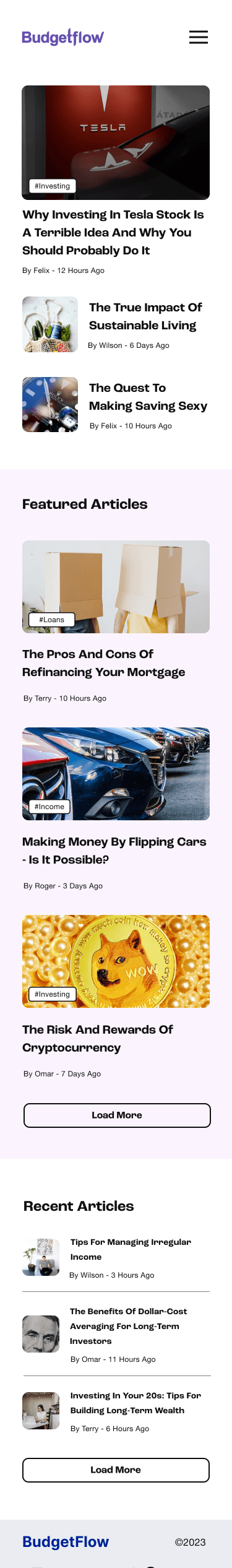
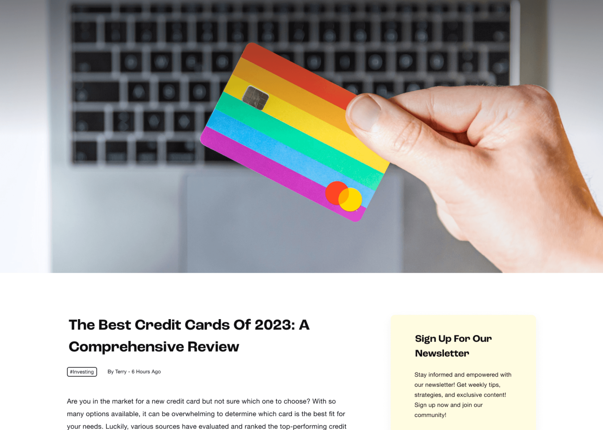
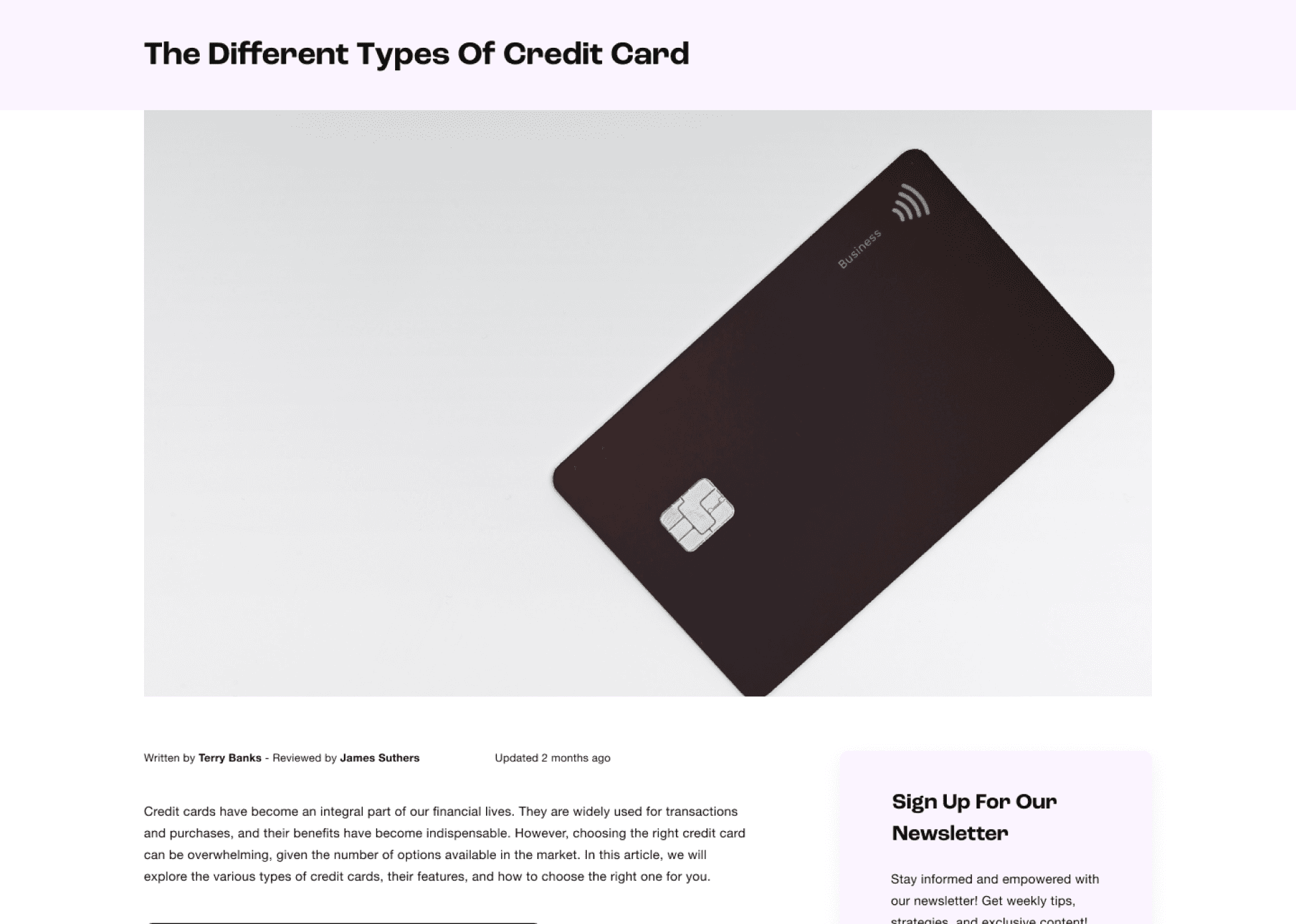
High Fidelity Wireframes
Home
Blog
Testing
Testing
Although my research revealed certain user habits and pain points, I was still not sure how I would structure a potential solution. Based on a hybrid card sort with 10 participants, I was able to craft an organized sitemap I could build upon.
Although my research revealed certain user habits and pain points, I was still not sure how I would structure a potential solution. Based on a hybrid card sort with 10 participants, I was able to craft an organized sitemap I could build upon.
Test Summary
5 Participants
30 min remote sessions
4 Tasks
Test flows
Testing landing page
Finding information about given topic
Book a meeting
Multiple paths
Multiple paths
Based on the different potential ways a user could find information, I made sure there were several paths to complete Task 2. This would also be beneficial in showing the most intuitive path for users to take.
I also wanted to see how participants navigated the site to find the submission page.
Based on the different potential ways a user could find information, I made sure there were several paths to complete Task 2. This would also be beneficial in showing the most intuitive path for users to take.
I also wanted to see how participants navigated the site to find the submission page.
Test Feedback
“I immediately understand what this site is and what it offers”
“It feels like an education site”
“I am not really sure what to expect when I book a session”
“Guides should be objective, while blogs should be subjective”
Key findings
Most participants decided to search or go to guides when looking for relevant information
A few of the participants had a hard time separating guides and blog articles visually
Participants felt that the submission page was lacking in terms of information and had no clue aboutwhat would happen after they had booked a session.
Finalizing
Finalizing
Design Reiterations
Guide Section Layout
Re-did the guide layout to differentiate them from the blog articles
Re-did the guide layout to differentiate them from the blog articles

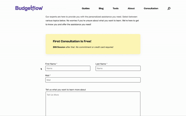
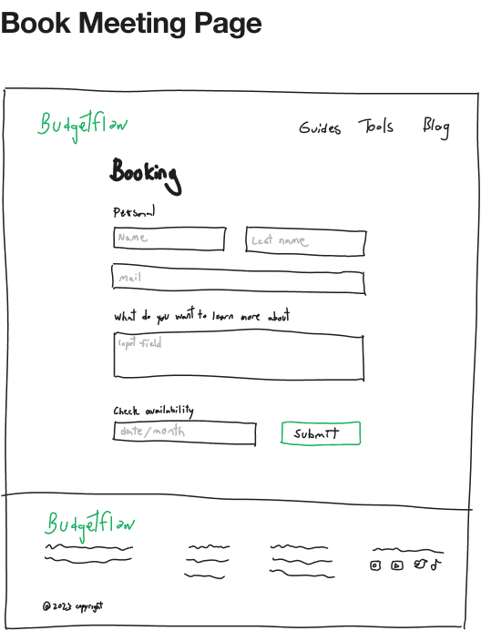
Submission Page Rework
Added better information to enforce trust
Added pricing information
Added time slot booking and topic selection dropdown
Added better information to enforce trust
Added pricing information
Added time slot booking and topic selection dropdown
Minor reiterations
Made H1 larger to make it stand out more from other header sizes
Changed a few guide titles
Changed some of the images that did not correlate with the guide topics
Conclusion
Conclusion
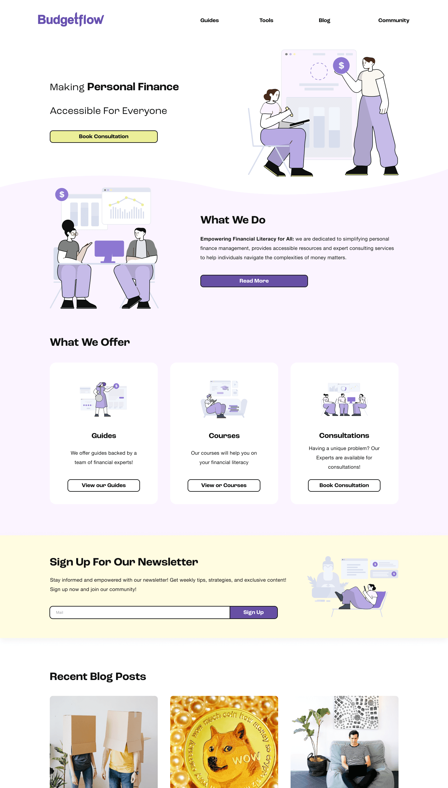
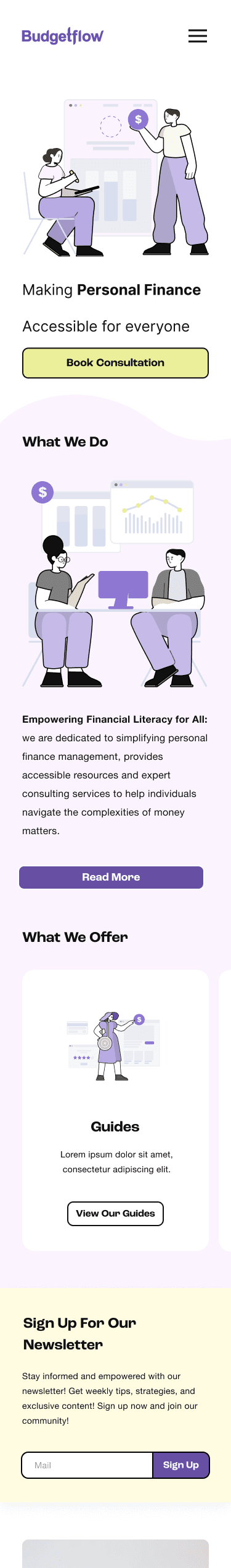
Final Version
Possible next steps for Budgetflow
Content strategy
Based on research, many participants were interested in video-content or podcasts. Having easily digestible content would be a great long-term strategy to market and monetize the Budgetflow brand.
Based on research, many participants were interested in video-content or podcasts. Having easily digestible content would be a great long-term strategy to market and monetize the Budgetflow brand.
Courses
Participants were positive overall to having courses that teach financial literacy. Working on a course program for the site could be a viable consideration going forward.
Participants were positive overall to having courses that teach financial literacy. Working on a course program for the site could be a viable consideration going forward.
Interactive Tools
Based on some of the user interviews, having financial tools as an aid could be beneficial.
Based on some of the user interviews, having financial tools as an aid could be beneficial.
Community Features
Not entirely based on research, however, Budgetflow could consider having a community feature as a strategy to build the brand. A built-in feature might not be necessary, but rather, using a third-party solution like Discord, Reddit or Facebook Groups instead.
Not entirely based on research, however, Budgetflow could consider having a community feature as a strategy to build the brand. A built-in feature might not be necessary, but rather, using a third-party solution like Discord, Reddit or Facebook Groups instead.
Personal Takeaways
Working on a startup project at such an early stage, made me realize that this was just as much a marketing research, as it was a design project. The design itself is not innovative in terms of features, but rather, it highlighted users' preferences in learning specific topics.
One key aspects that I were unable to test, was the bounce and retention rate of a website like this. Although I got an understanding of what participants liked and disliked about the website, knowing what works in terms of content can be challenging. similar to design, this is often done through methods like A/B testing and overall trial and error. If Budgetflow decides to stick with this or a similar solution, they will have to figure out their content strategy.
One of the unexpected takeaways I got was designing the booking page. It was interesting to see what expectations participants had about the page based on the information they read. Ironically, as I have gradually come to understand, having an abundance of information could also overwhelm users in this regard.

© 2024 Kristian Storli
© 2024 Kristian Storli